Project:
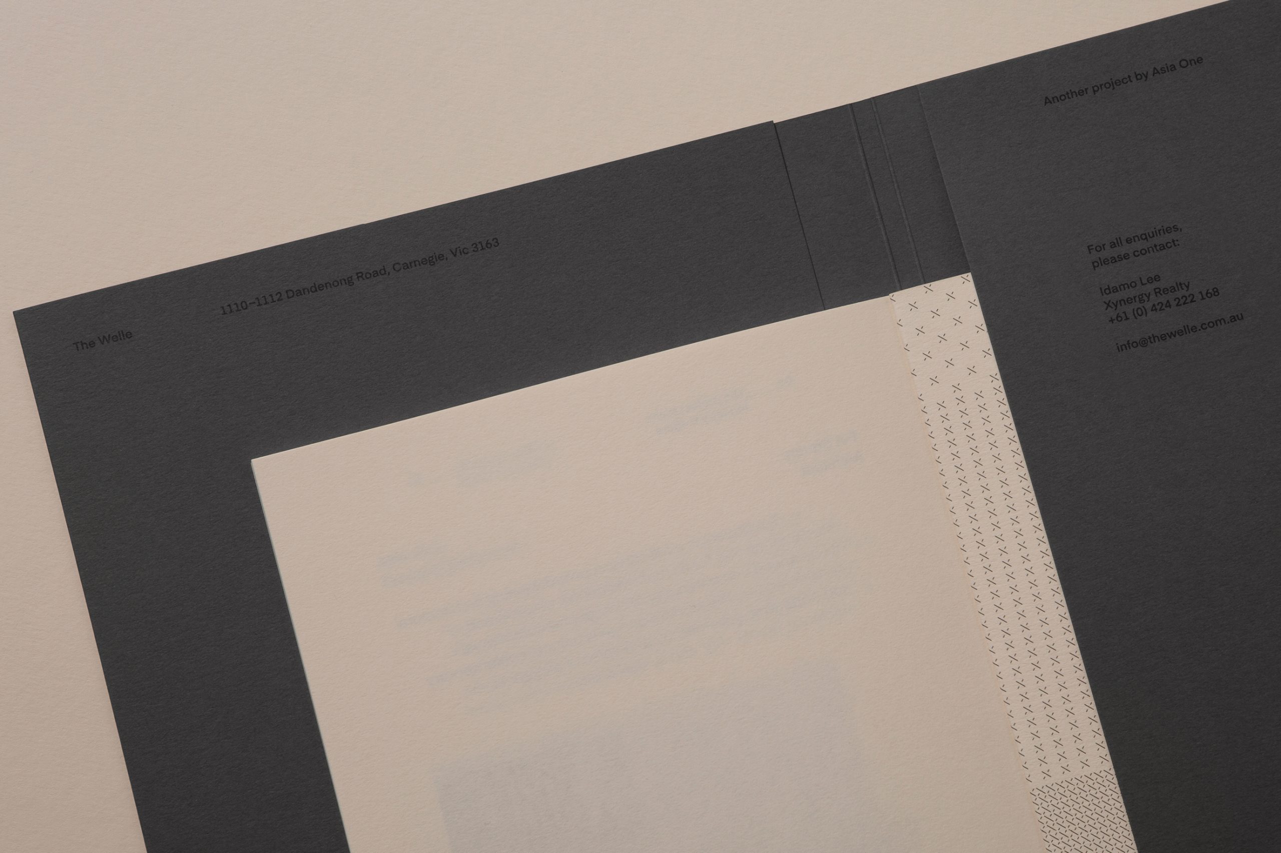
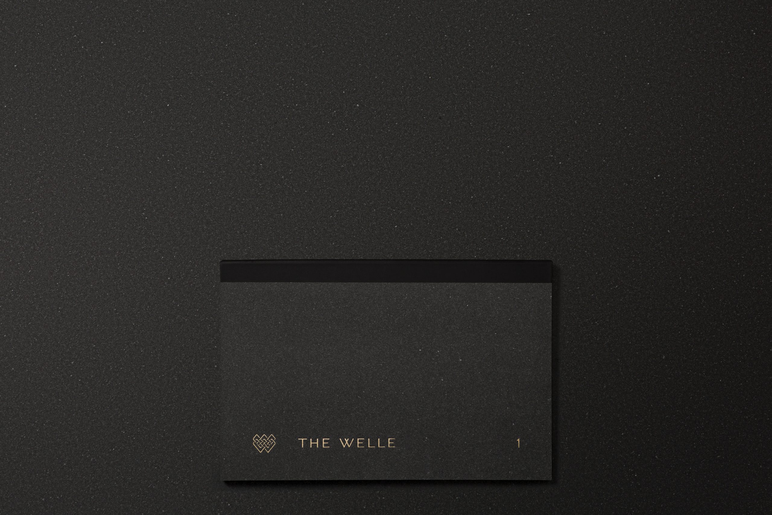
The Welle
Key Message:
Established and culturally rich.
The Welle
Key Message:
Established and culturally rich.
Sector:
Property
Scope of Works:
Art Direction
Brand Identity
Campaign
Creative Strategy
Graphic Design
Naming
Print Design
Property
Scope of Works:
Art Direction
Brand Identity
Campaign
Creative Strategy
Graphic Design
Naming
Print Design
Snapshot:
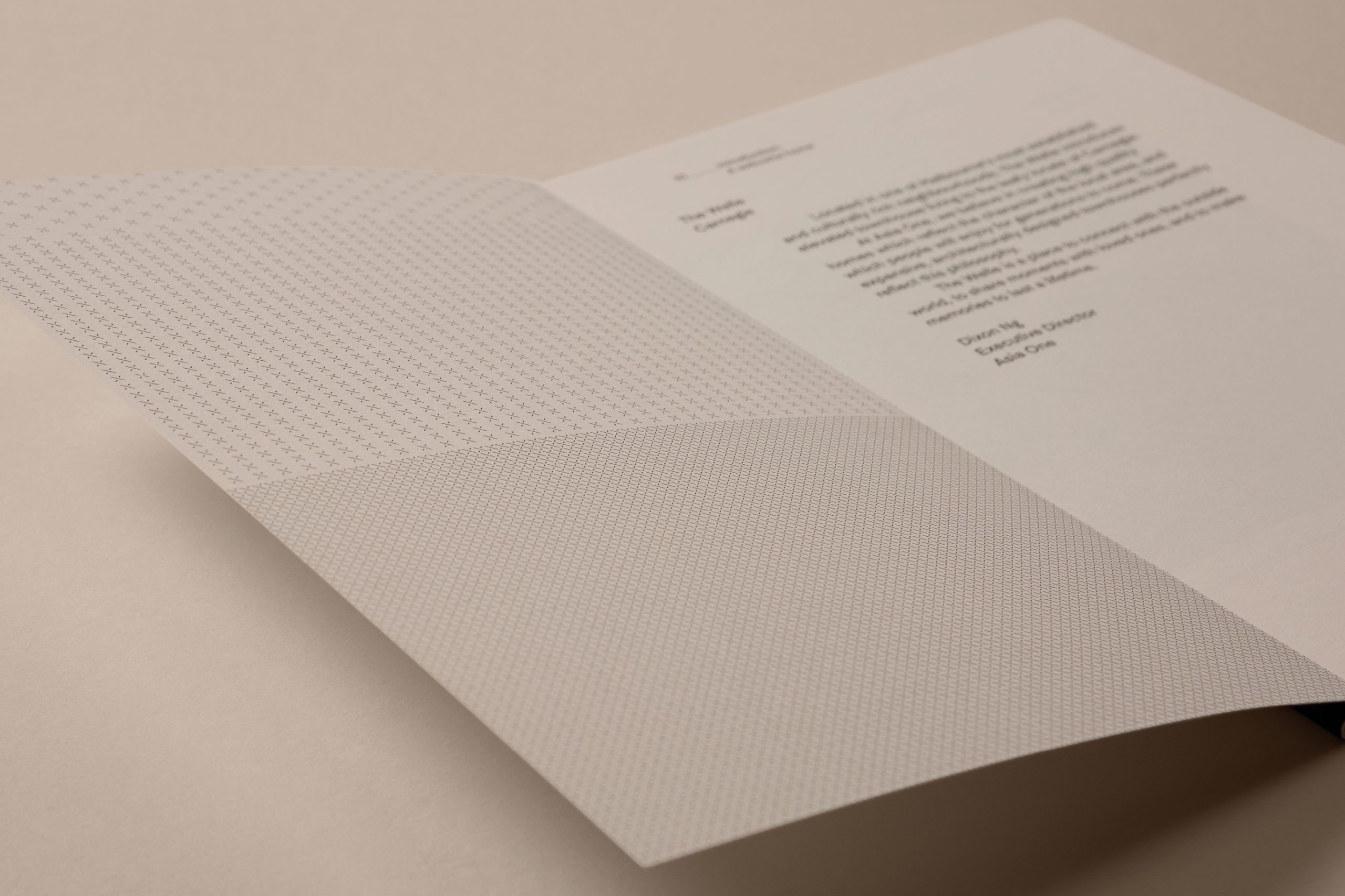
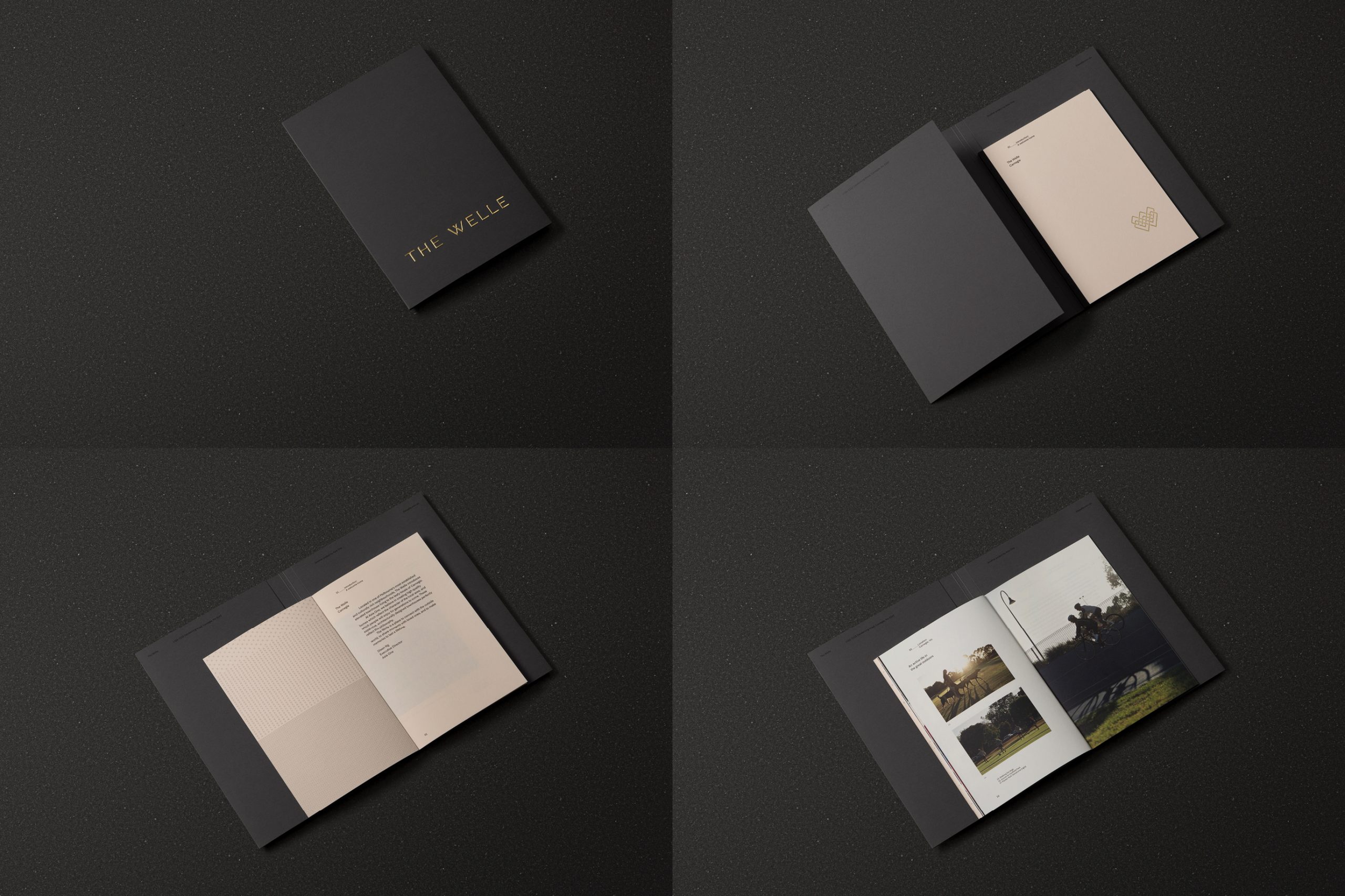
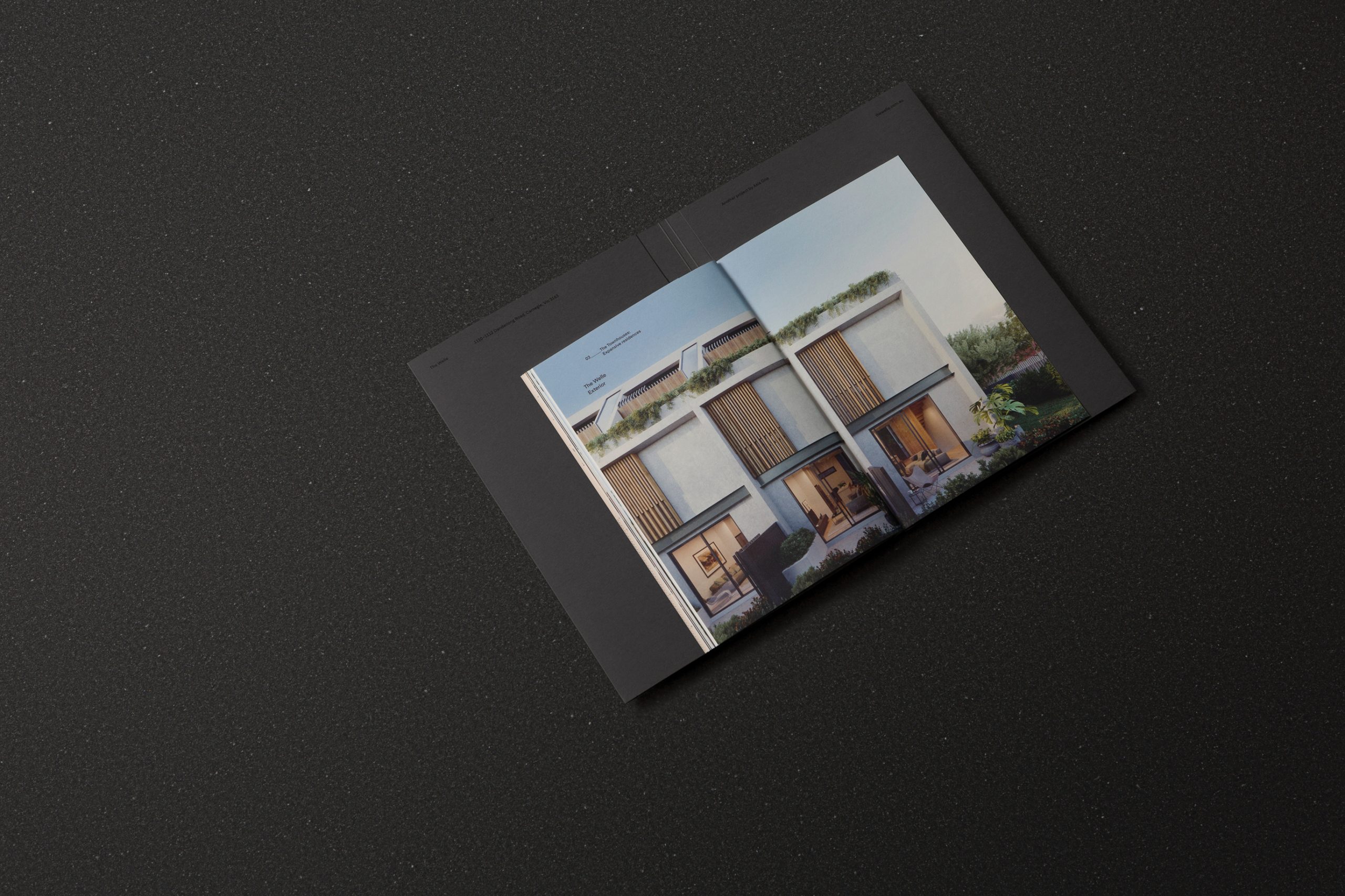
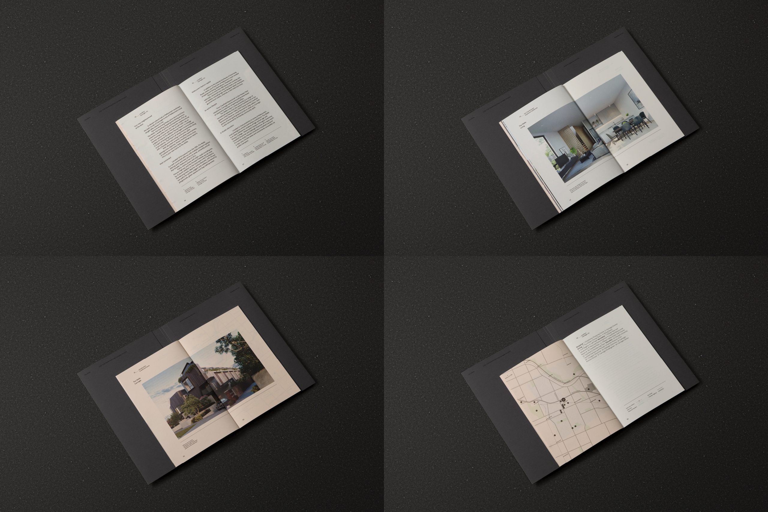
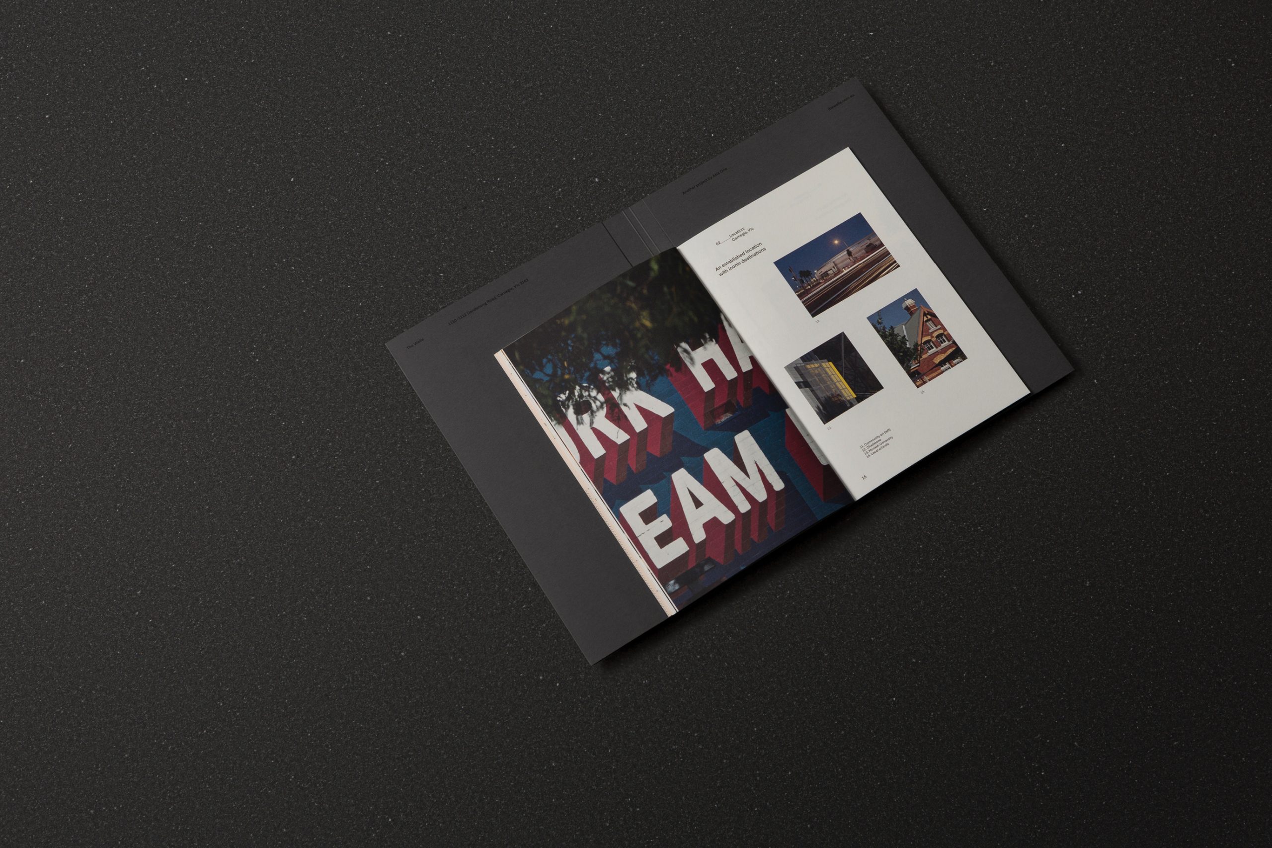
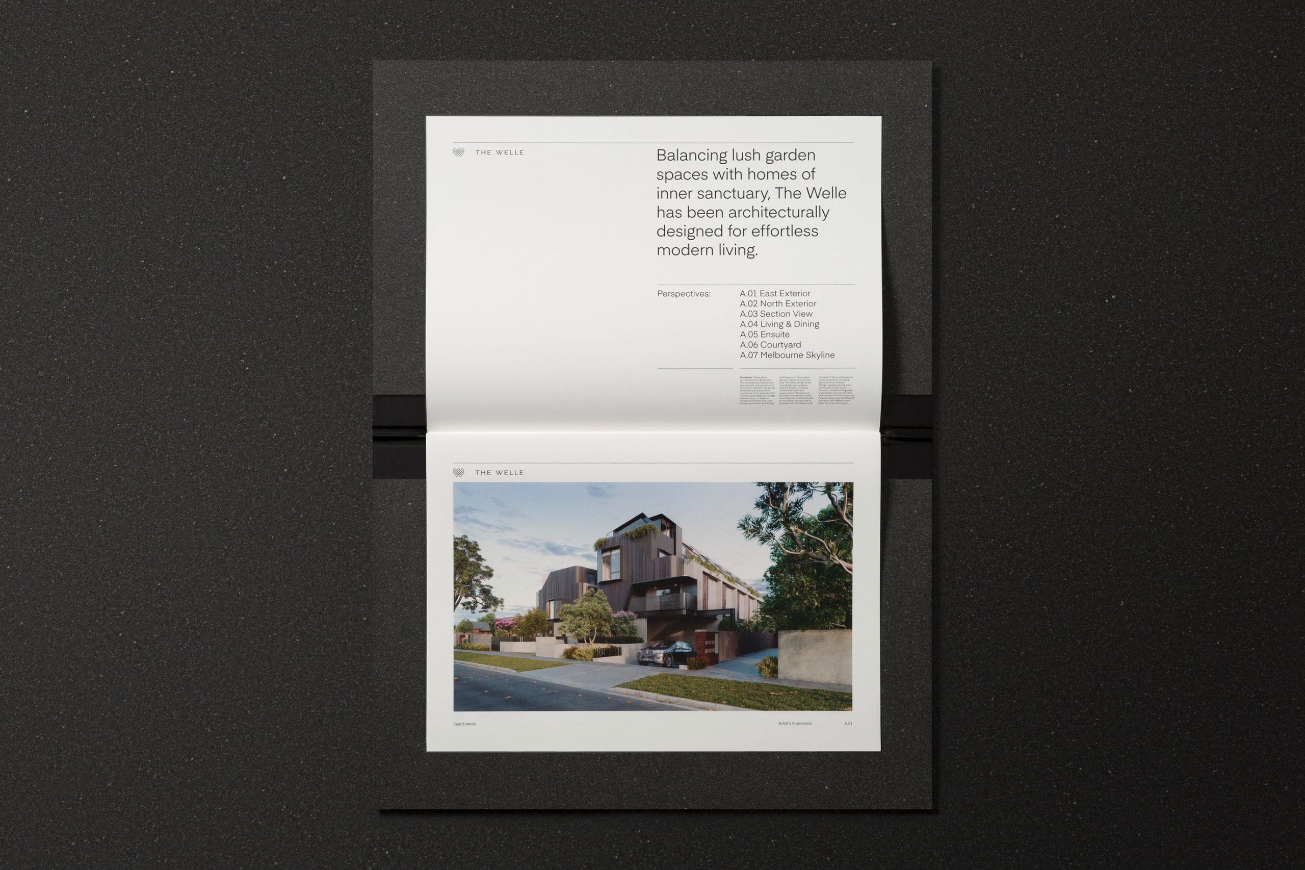
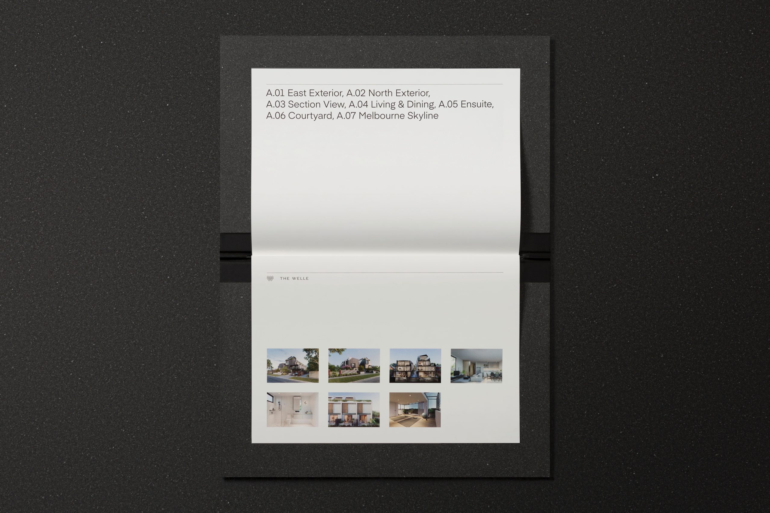
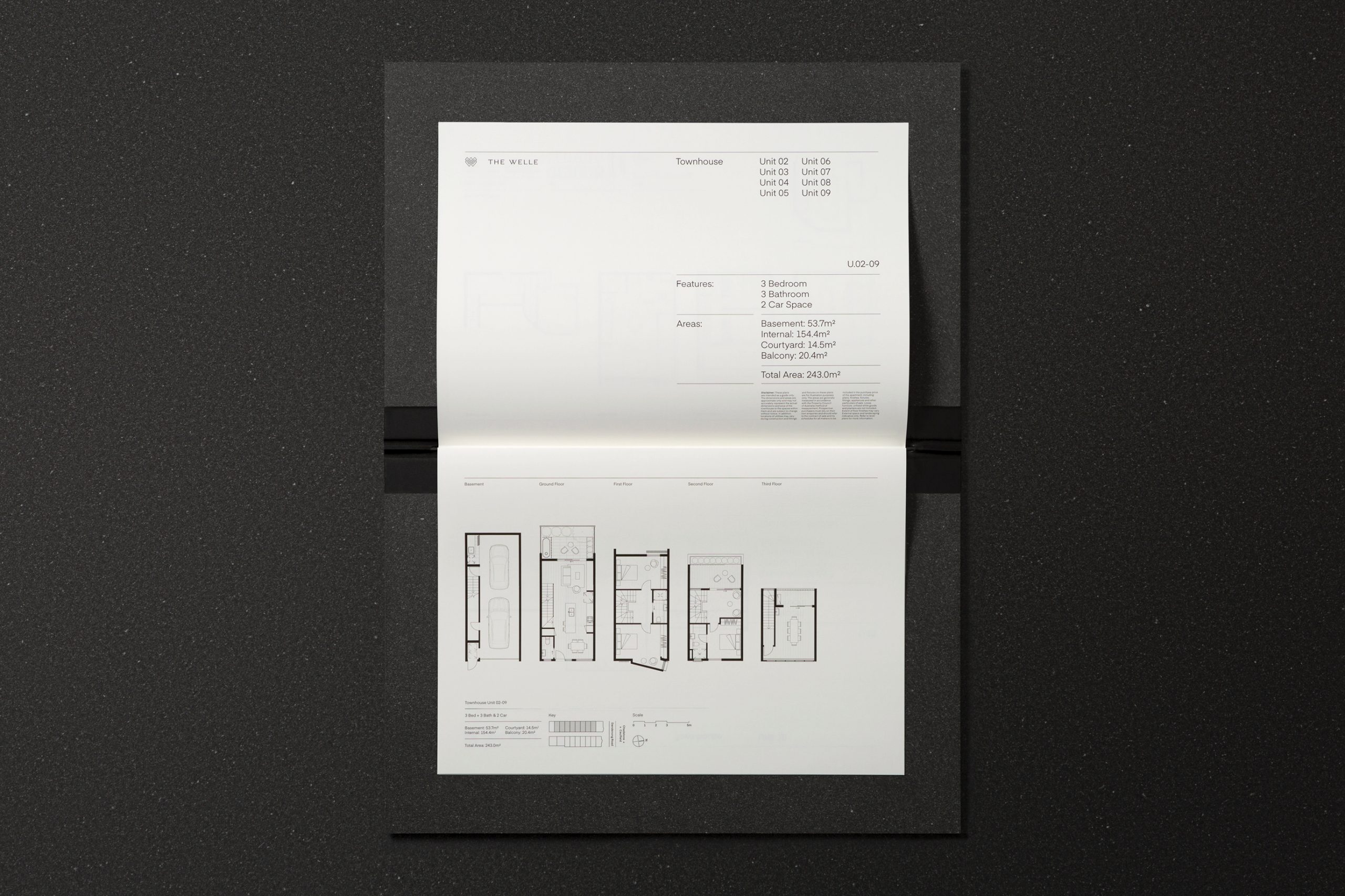
The Welle introduces elevated townhouse living to one of Melbourne’s most established and culturally rich neighbourhoods, Carnegie. These expansive, architecturally designed townhouses perfectly reflect this philosophy. Asia One believe in creating high-quality homes which demonstrate the character of the local area, homes people will enjoy for generations to come. The Welle is a place to connect with the outside world, to share moments with loved ones, and to make memories to last a lifetime.
The Objective: A visual identity that effectively captures, articulates and communicates the Welle’s unique market message.
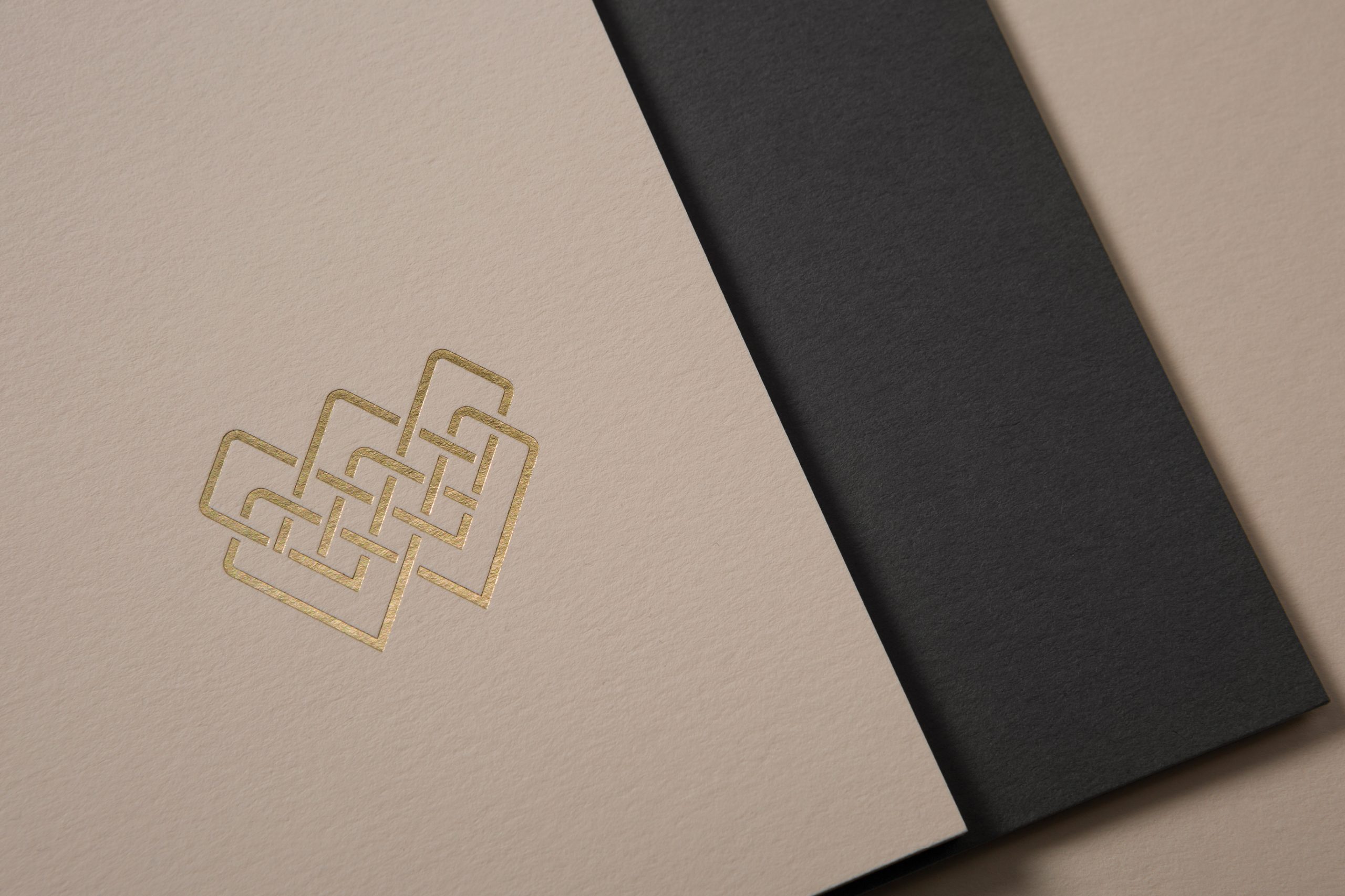
The Opportunity: Create a visual identity that communicates the unique opportunity and culturally rich lifestyle that exists in Carnegie, ensuring that this market message flows seamlessly across all aspects of the brand collateral. ‘Welle’ is a German word for wave, a topographic word referring to someone who lives by a stream or spring. This idea of waves creates a sense of flow and rhythm, evoking the buyer’s potential lifestyle in this property; the rhythm of day-to-day life and family, in their home.
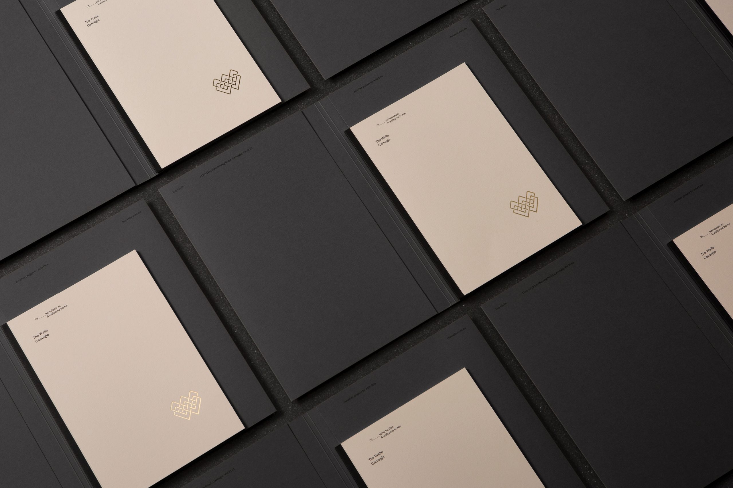
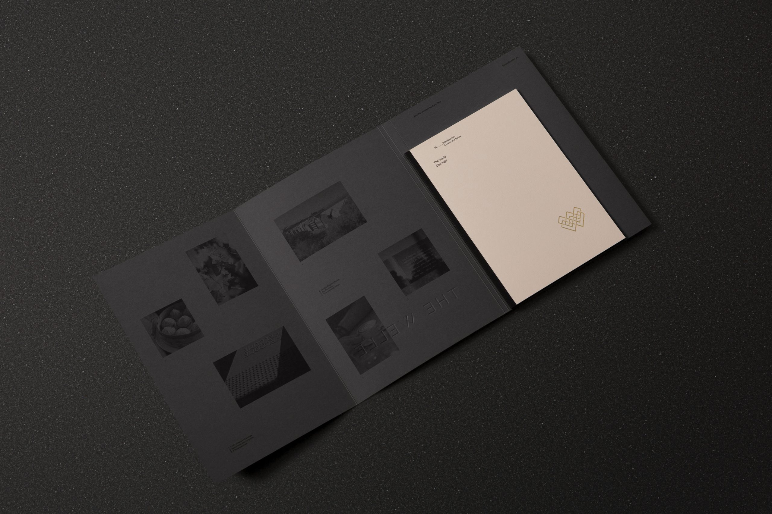
The Outcome: Our creative execution embodies a visual flow, where the logo and visual identity seamlessly connect through a harmonious colour palette, sophisticated and timeless typographic approach and high-quality print and finishing.
The Welle introduces elevated townhouse living to one of Melbourne’s most established and culturally rich neighbourhoods, Carnegie. These expansive, architecturally designed townhouses perfectly reflect this philosophy. Asia One believe in creating high-quality homes which demonstrate the character of the local area, homes people will enjoy for generations to come. The Welle is a place to connect with the outside world, to share moments with loved ones, and to make memories to last a lifetime.
The Objective: A visual identity that effectively captures, articulates and communicates the Welle’s unique market message.
The Opportunity: Create a visual identity that communicates the unique opportunity and culturally rich lifestyle that exists in Carnegie, ensuring that this market message flows seamlessly across all aspects of the brand collateral. ‘Welle’ is a German word for wave, a topographic word referring to someone who lives by a stream or spring. This idea of waves creates a sense of flow and rhythm, evoking the buyer’s potential lifestyle in this property; the rhythm of day-to-day life and family, in their home.
The Outcome: Our creative execution embodies a visual flow, where the logo and visual identity seamlessly connect through a harmonious colour palette, sophisticated and timeless typographic approach and high-quality print and finishing.
Credits:
Copywriting by Bigwords
Photography (Collateral) by Foliolio
Photography (Location) by Guy Lavoipierre
Printing by Gunn & Taylor
Copywriting by Bigwords
Photography (Collateral) by Foliolio
Photography (Location) by Guy Lavoipierre
Printing by Gunn & Taylor